Client: Maricopa County Treasurer's Office
Duration: 4 weeks
Role: UX/UI Designer
Project Type: Design System Rebuild & Expansion
Tools Used: Figma, Adobe Illustrator
Duration: 4 weeks
Role: UX/UI Designer
Project Type: Design System Rebuild & Expansion
Tools Used: Figma, Adobe Illustrator
Overview:
At the outset of the project, I inherited a basic design system created by a previous designer who was no longer with the team. While it provided a starting point, it lacked the structure, documentation, and consistency required to support the evolving needs of our developers and design team.
At the outset of the project, I inherited a basic design system created by a previous designer who was no longer with the team. While it provided a starting point, it lacked the structure, documentation, and consistency required to support the evolving needs of our developers and design team.
My goal was to audit, rebuild, and expand the system so it could serve as a clear, reliable source of truth. This meant addressing existing inconsistencies, improving usability, and establishing a more scalable foundation aligned with current project goals and front-end implementation.
Impact:
After implementing the rebuilt design system, the team saw immediate and measurable improvements in workflow efficiency and product consistency:
• 50% reduction in design-to-development handoff revisions within the first two weeks.
• Faster iteration cycles, with early-stage mockups moving into development 30% faster.
• Consistent application of core components across 90% of reviewed pages, up from less than 50% before the rebuild.
• Reduced developer confusion by consolidating undocumented UI rules into a single, accessible source of truth.
These improvements not only increased team confidence and reduced rework but also laid the groundwork for scalable, maintainable design across future Treasurer’s Office projects.
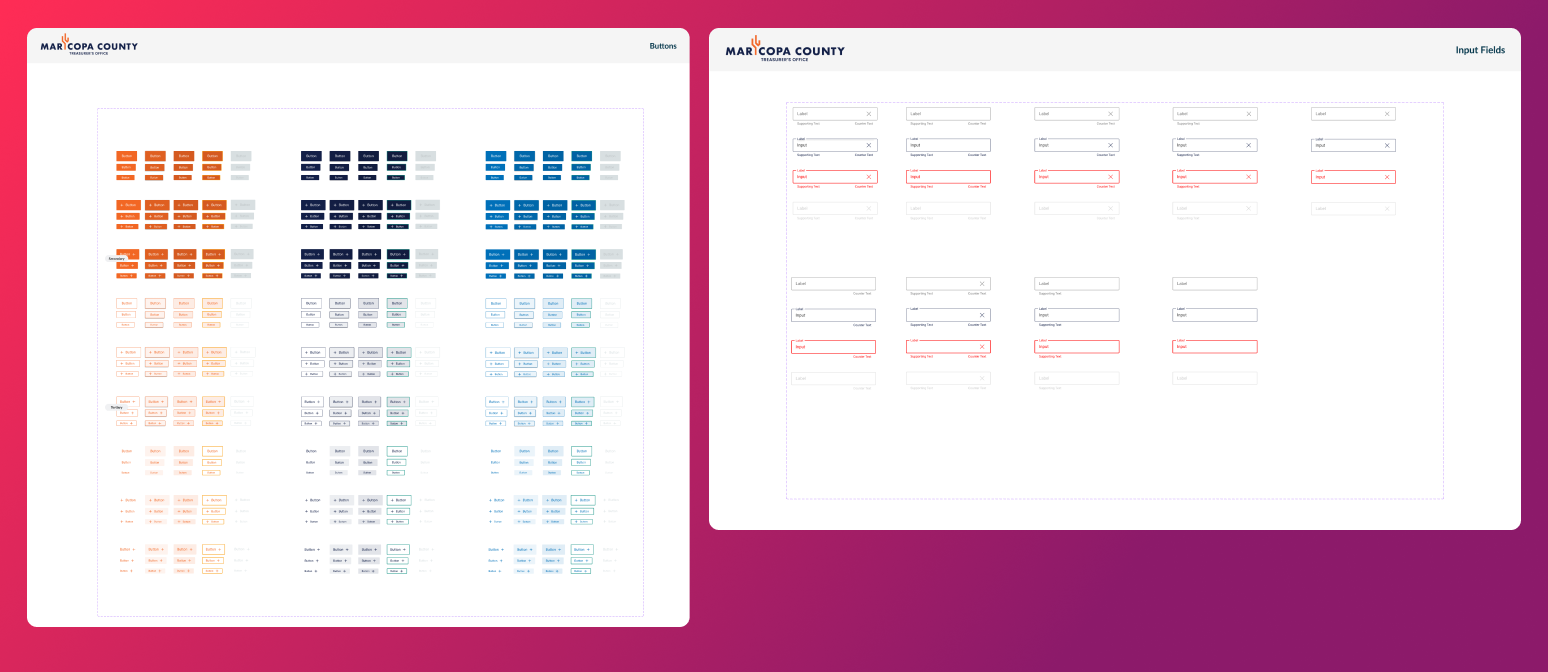
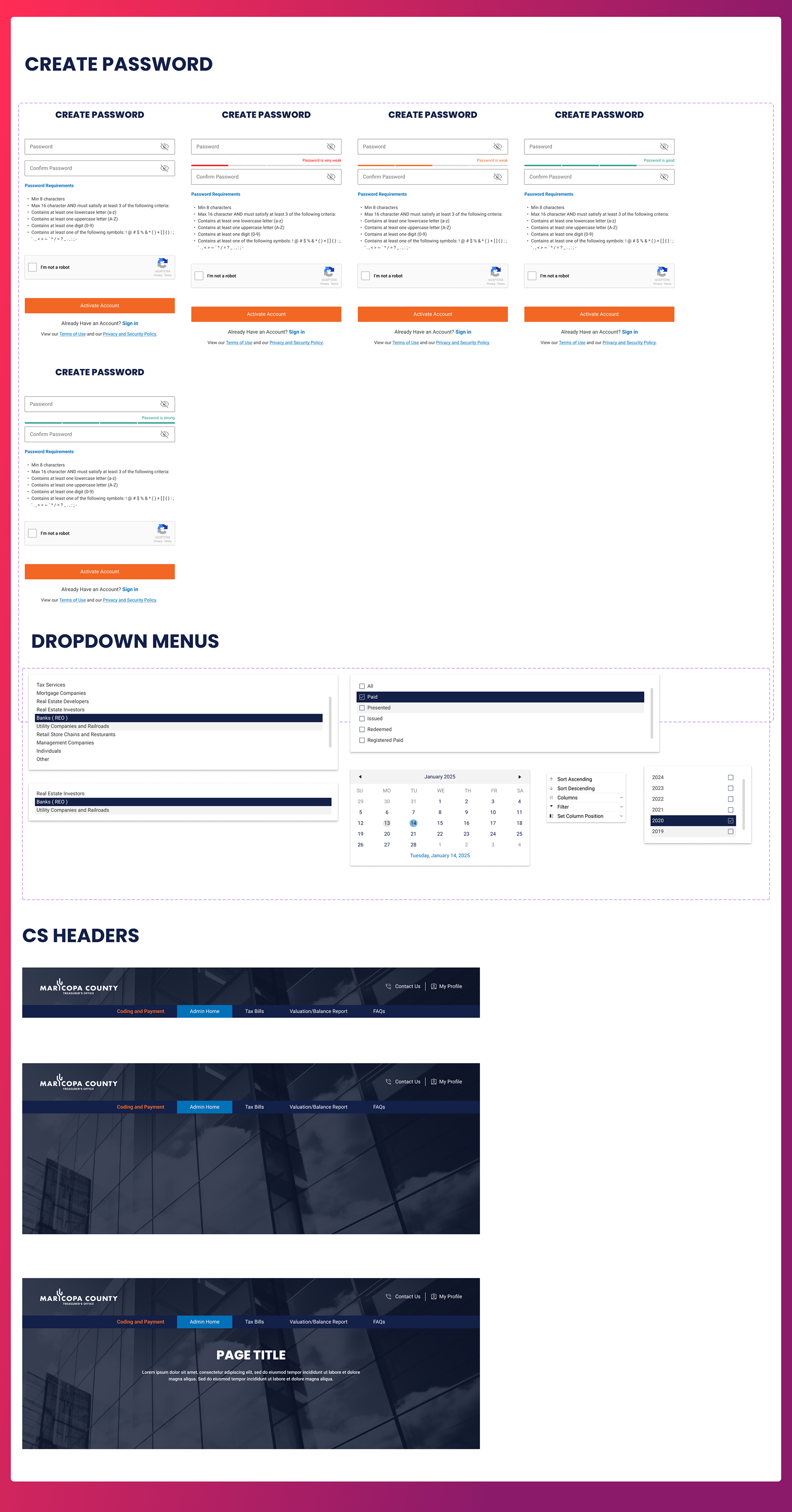
Examples of Final Design System Components
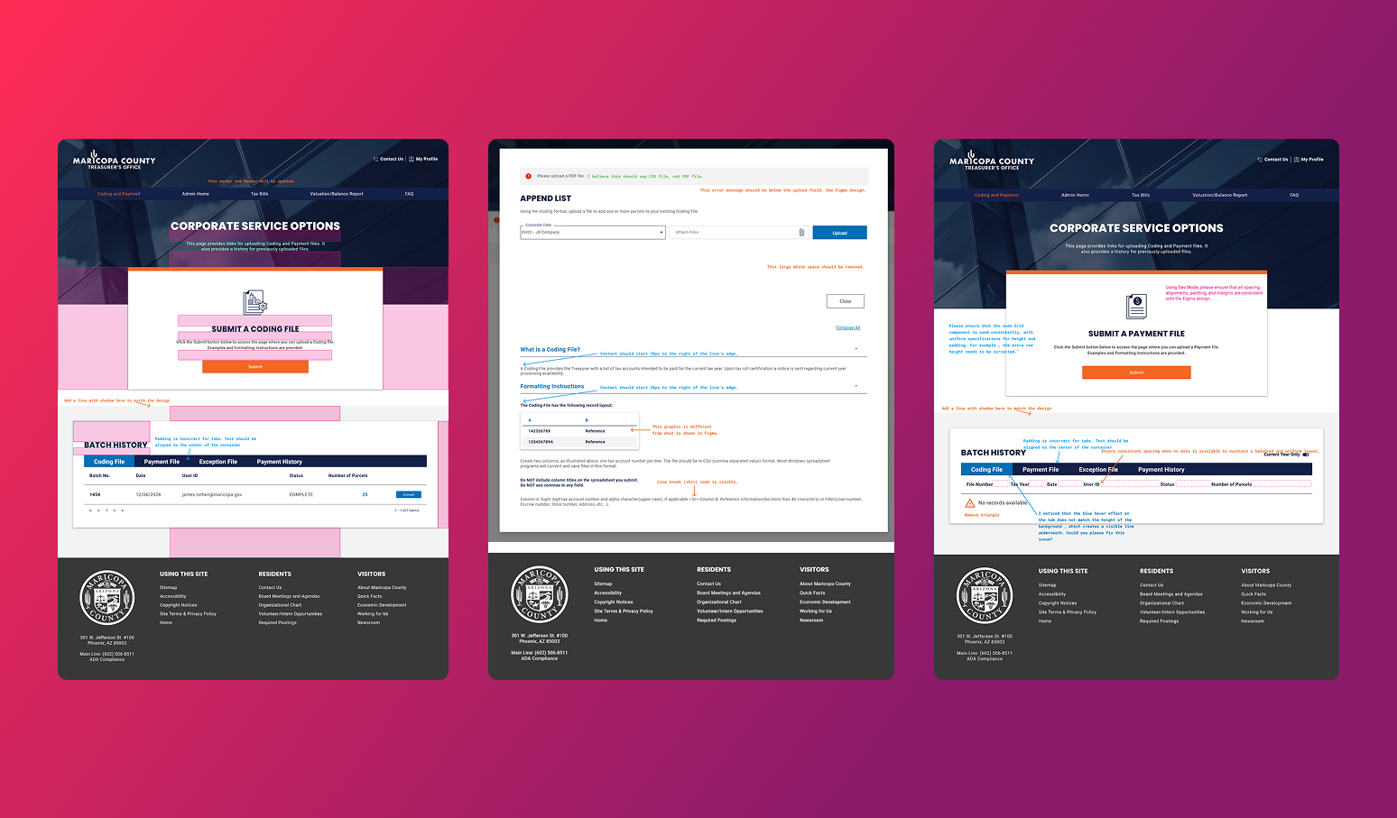
UI Audit & Prioritization:
I conducted a full audit of all developed pages that had implemented the original design system. Each screen was reviewed and redlined based on five key issue categories:
I conducted a full audit of all developed pages that had implemented the original design system. Each screen was reviewed and redlined based on five key issue categories:
Inconsistent Use of Components – Elements used outside intended styles or variations
Design Mismatches – Visual discrepancies from intended specs (e.g., colors, fonts, icon usage)
UX (Functionality) – Interaction issues or confusing behavior patterns
Alignment, Spacing, Padding – Layout inconsistencies that affected visual rhythm and clarity
Content – Issues with copy, labeling, hierarchy, or tone
I prioritized fixes based on impact and frequency, focusing first on areas that would reduce developer confusion and improve overall consistency across the interface.
Component Inventory & Gap Analysis:
After the audit, our design team cataloged all recurring interface elements. We identified which components were being used consistently and which ones lacked structure or documentation.
After the audit, our design team cataloged all recurring interface elements. We identified which components were being used consistently and which ones lacked structure or documentation.
A critical discovery was that many developers had resorted to creating their own component libraries due to missing or unclear guidance in the existing system. This insight shaped the direction of our rebuild and helped us prioritize components that needed immediate standardization.
Design Audit Examples
Key Deliverables:
The rebuilt design system included a comprehensive library of reusable UI components, layout patterns, and brand elements designed to support clarity, consistency, and accessibility across all Treasurer’s Office digital products.
The rebuilt design system included a comprehensive library of reusable UI components, layout patterns, and brand elements designed to support clarity, consistency, and accessibility across all Treasurer’s Office digital products.
Core Components:
• Buttons (primary, secondary, icon-only)
• Input fields and form elements (text fields, dropdowns, toggles)
• Typography styles (headings, body text, labels)
• Color schemes with accessible contrast ratios
• Layout grids and spacing tokens
• Logo usage rules and brand guidelines
• Iconography set aligned with civic use cases
• Tables and data display components
• System messages (success, error, warning, info)
Example Pages & Libraries
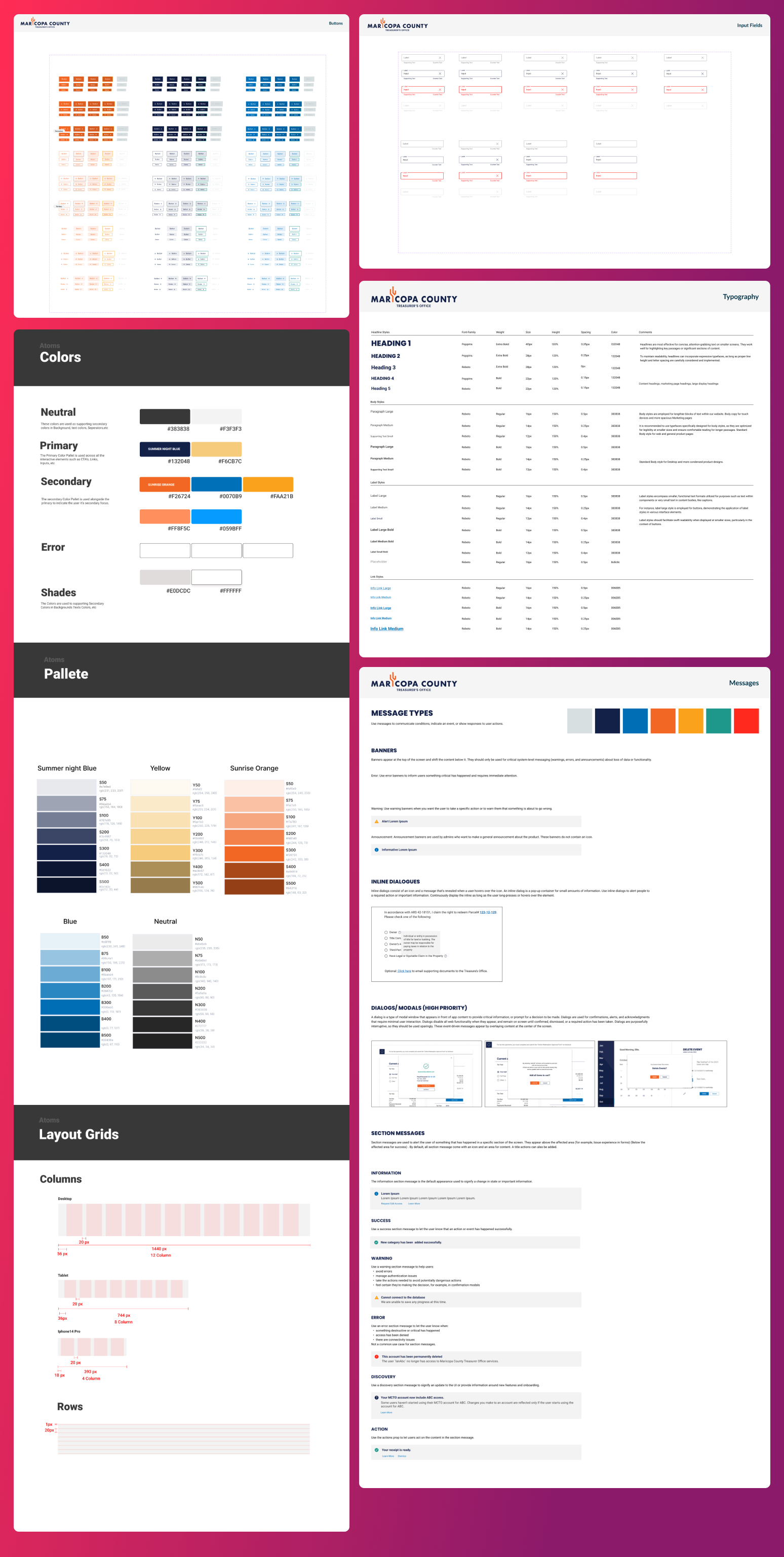
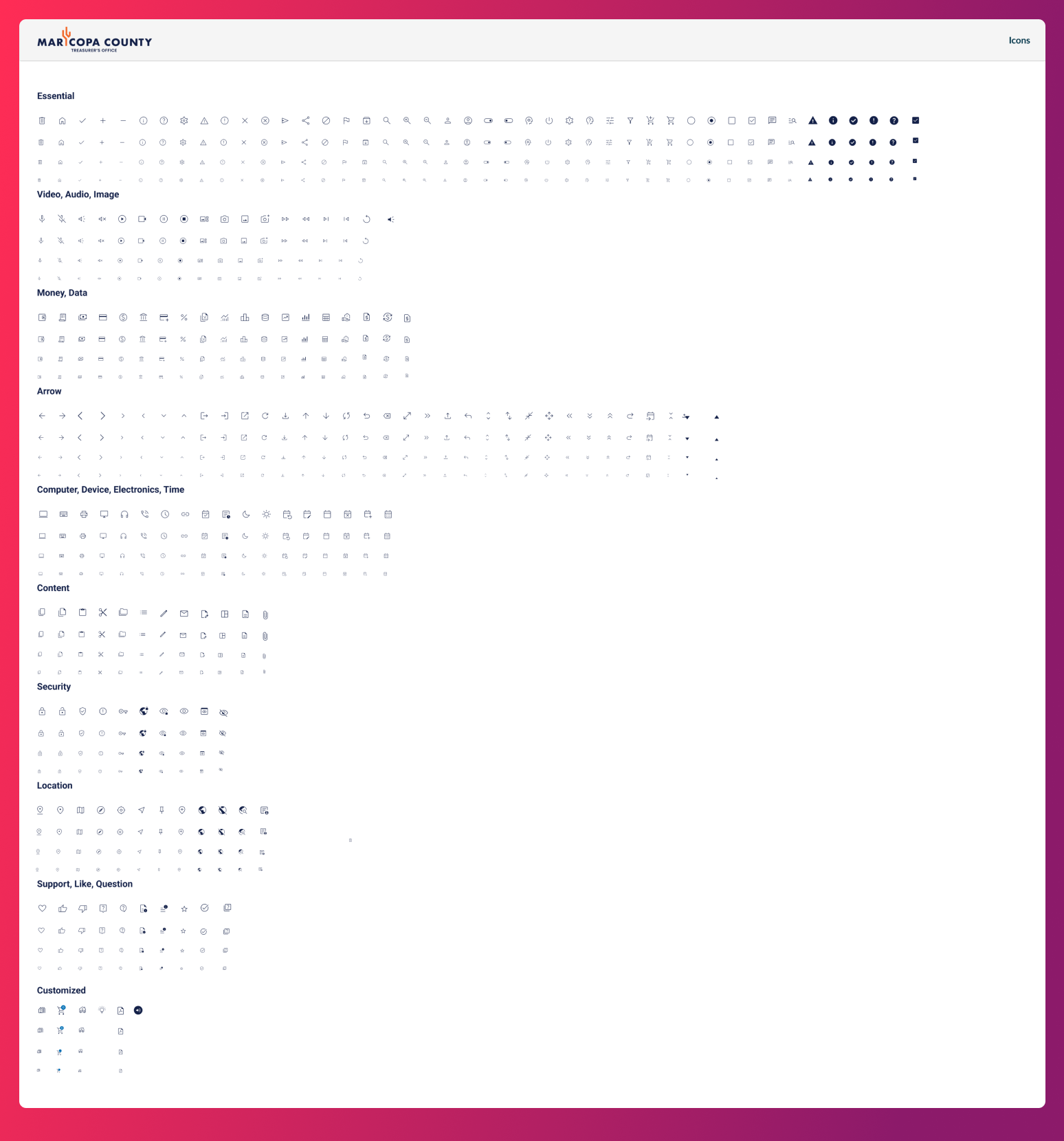
Common Component Examples
Reflection:
Looking back, the biggest takeaway from this project was the importance of establishing a solid design system before development begins. While I wasn’t part of the initial decision to move forward without one, the consequences were clear: inconsistent implementation, duplicated components, and a slower, more error-prone workflow for both designers and developers.
Looking back, the biggest takeaway from this project was the importance of establishing a solid design system before development begins. While I wasn’t part of the initial decision to move forward without one, the consequences were clear: inconsistent implementation, duplicated components, and a slower, more error-prone workflow for both designers and developers.
Had the system been built earlier, much of the rework and confusion could have been avoided—saving time and ensuring greater alignment from the start.
That said, the process of rebuilding and formalizing the system mid-project taught me how to balance UX best practices with real-world constraints. Collaborating closely with the development team to retrofit structure into an active build reinforced the value of flexibility, empathy, and clear communication across disciplines.
The design system I created remains in use today and continues to serve as a foundation for new pages and features. It not only brought much-needed consistency to the current product but also helped establish better design and development habits moving forward.